A Bigger Mark
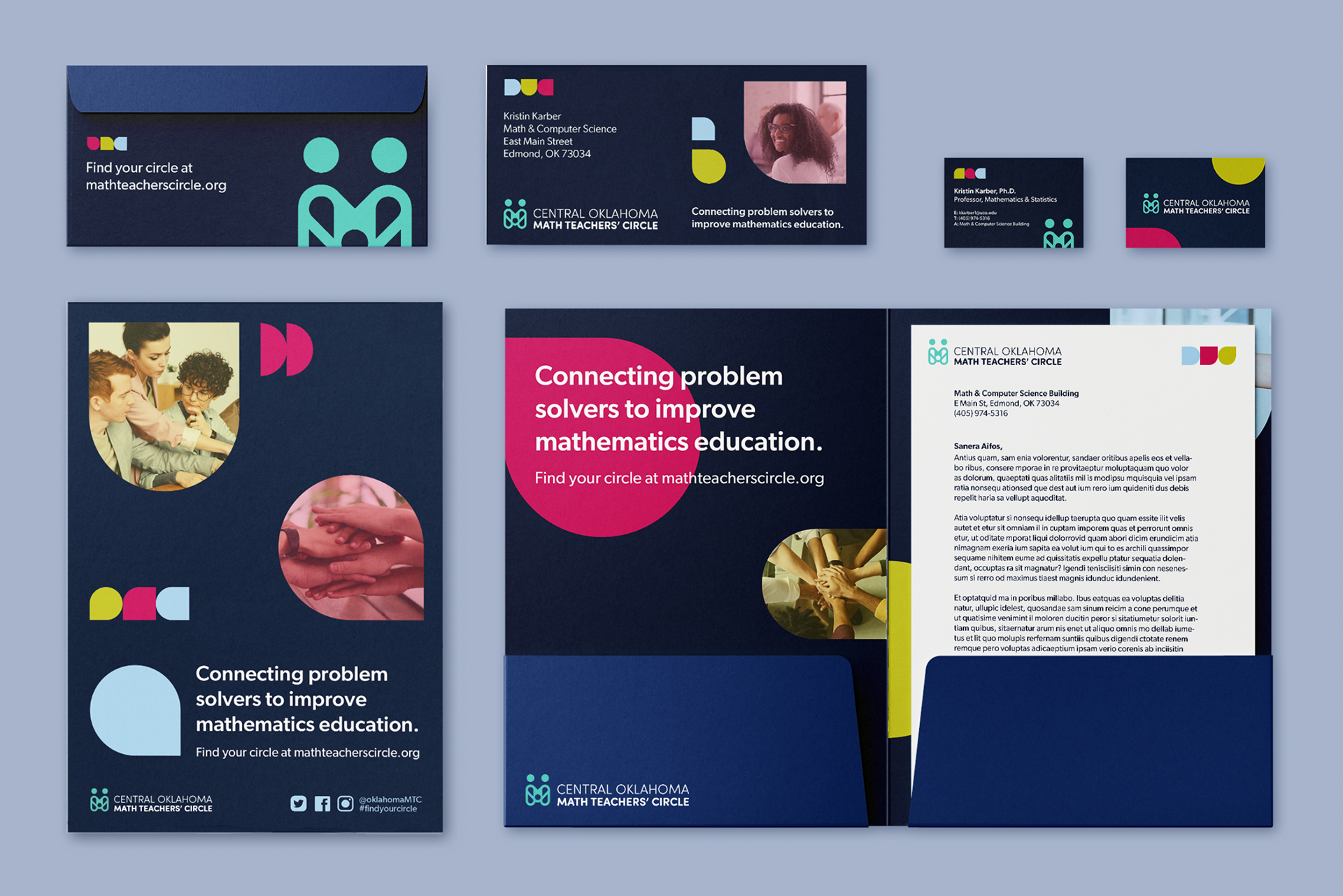
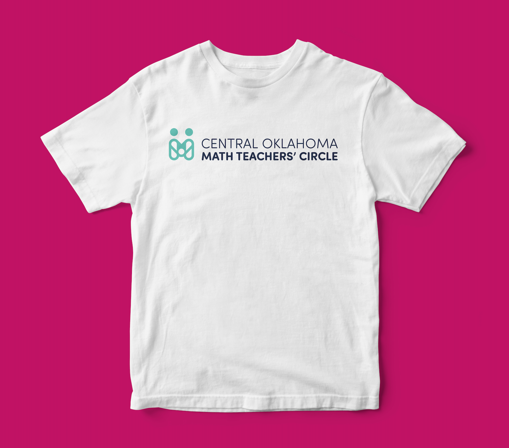
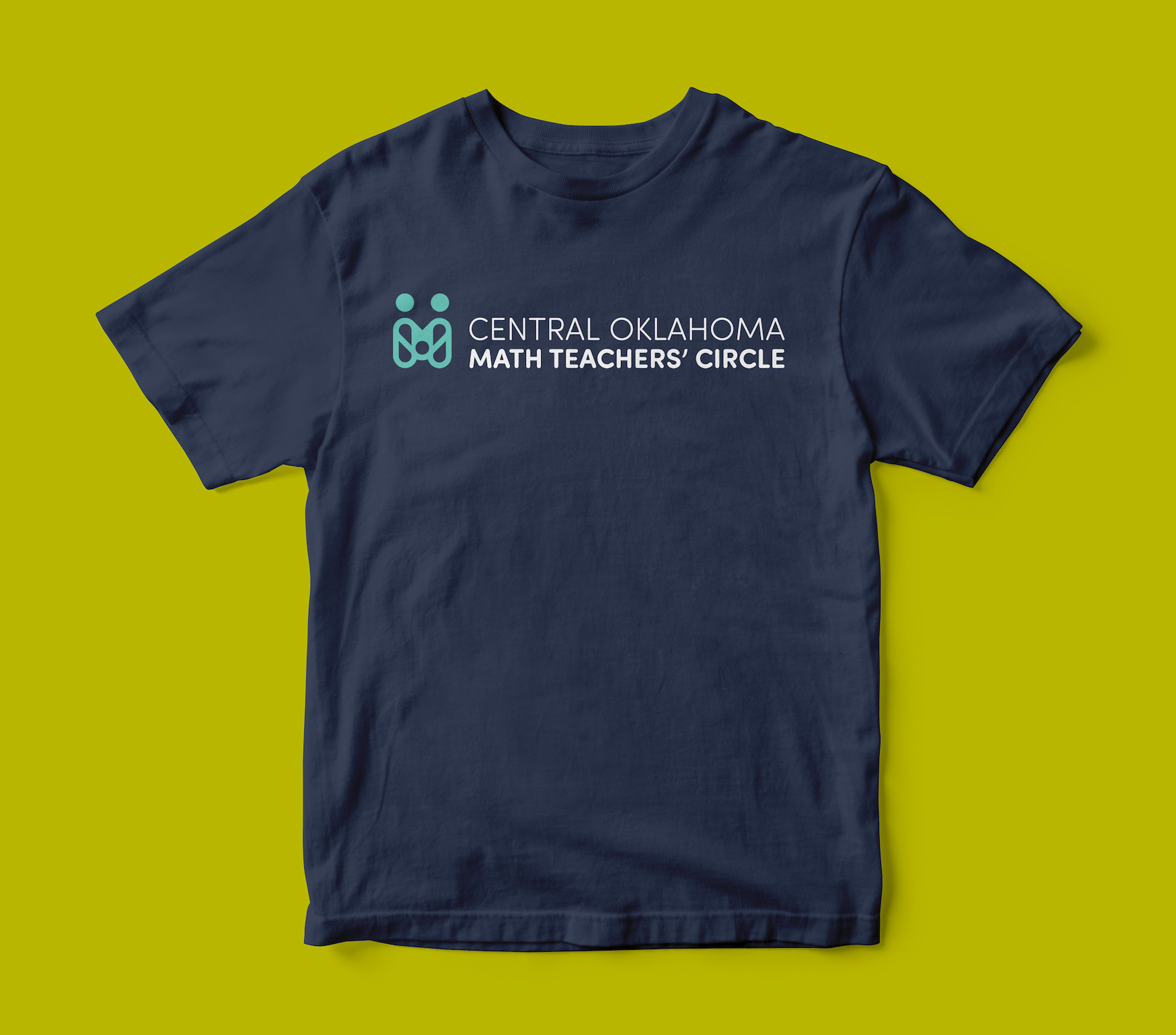
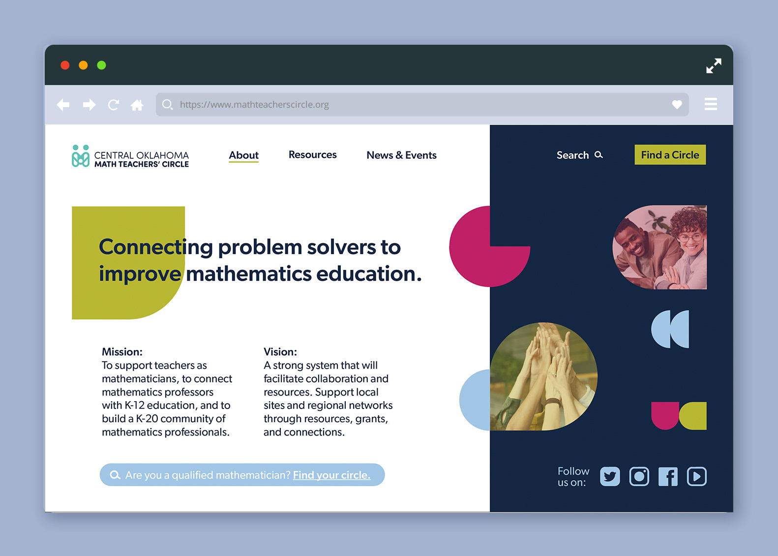
Central Oklahoma Math Teachers’ Circle proposed logo and brand identity demonstrates making a mark through connection. This is made between people, like the two in the logo, to make something bigger. In this case, two come together to make an “M” shape representing “Math” and a circle in the middle for “Circle”. This visually demonstrates what Central Oklahoma Math Teachers' Circle does, come together to create a bigger mark.
Awarded American Advertising Awards, Gold for Logo Design